






Want to know whether a black and white photo creates more emotion, and how to choose between color and monochrome for framing? Here is the essential version, with comparisons and a quiz.
Key takeaways Spoiler alert
- Black and white strengthens emotion by putting light, expressions and contrast first.
- Color helps transmit atmosphere and energy, while black and white creates a more timeless reading.
- For a successful framed image, look for a picture that reads well from a distance, with clear contrast and a strong subject.
Interactive quiz
Are you more black and white... or color?
Five ultra-fast questions to reveal your preference and help you choose what creates the strongest emotion.
At first glance, what grabs you most?
For a striking portrait, you prefer:
For a framed print at home, you want:
When you hesitate, you think:
When facing a very colorful scene:
Black and white vs color: what changes to the eye
To make the difference tangible, the best method is to compare the same image in color and in black and white. Below, two interactive comparisons let you switch between both versions.
Comparison 1
Wedding couple photo: emotion, skin, fabric and gaze

Click the button to switch between the color and black and white versions.
On a wedding image, color often gives a warm first impression through skin tones, flowers, decor and atmosphere. In black and white, attention shifts toward the look, the tension of a smile, the light on a cheek, the texture of a veil and the contrast of a suit. The monochrome version often feels closer and more emotional.
Comparison 2
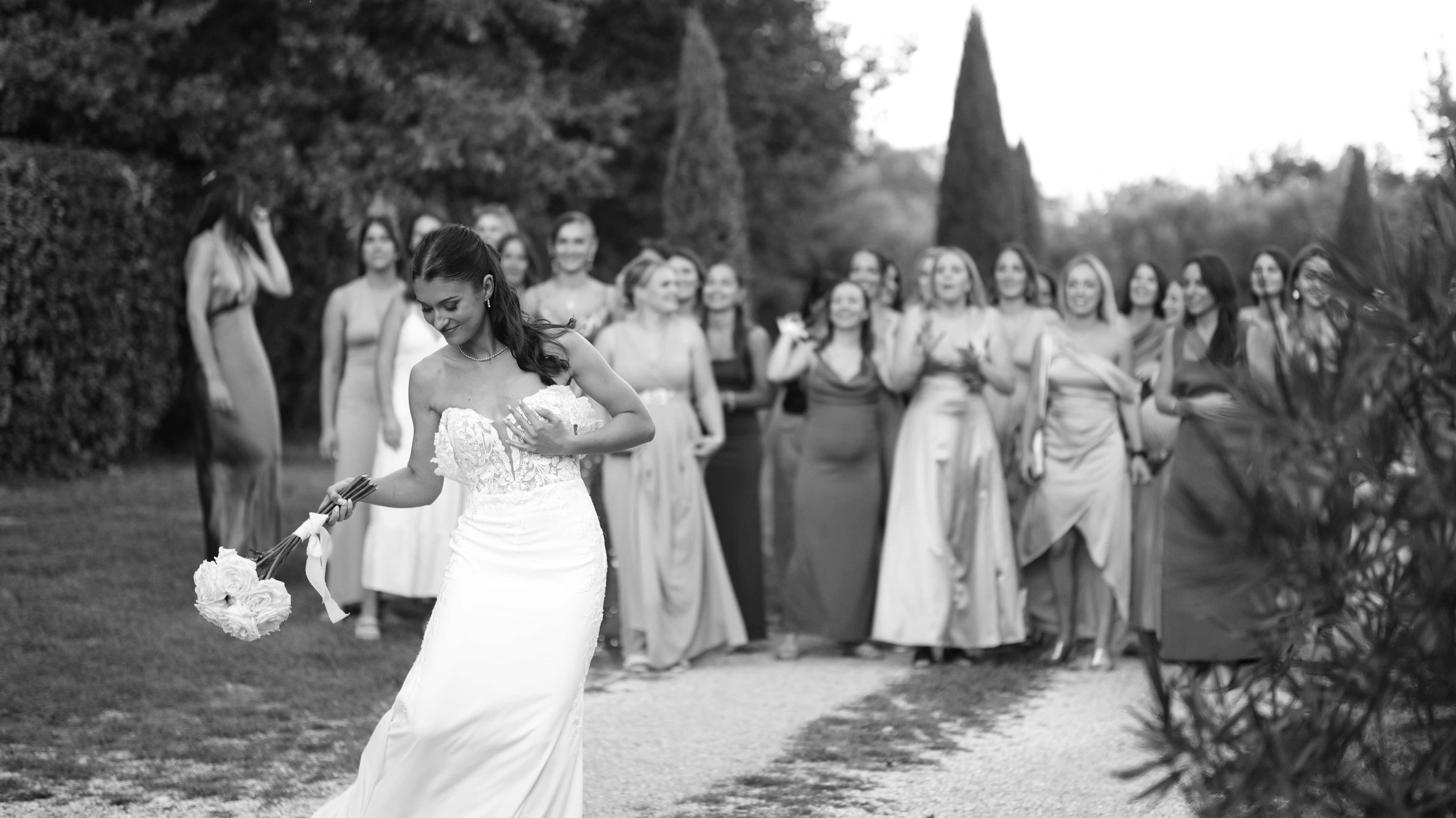
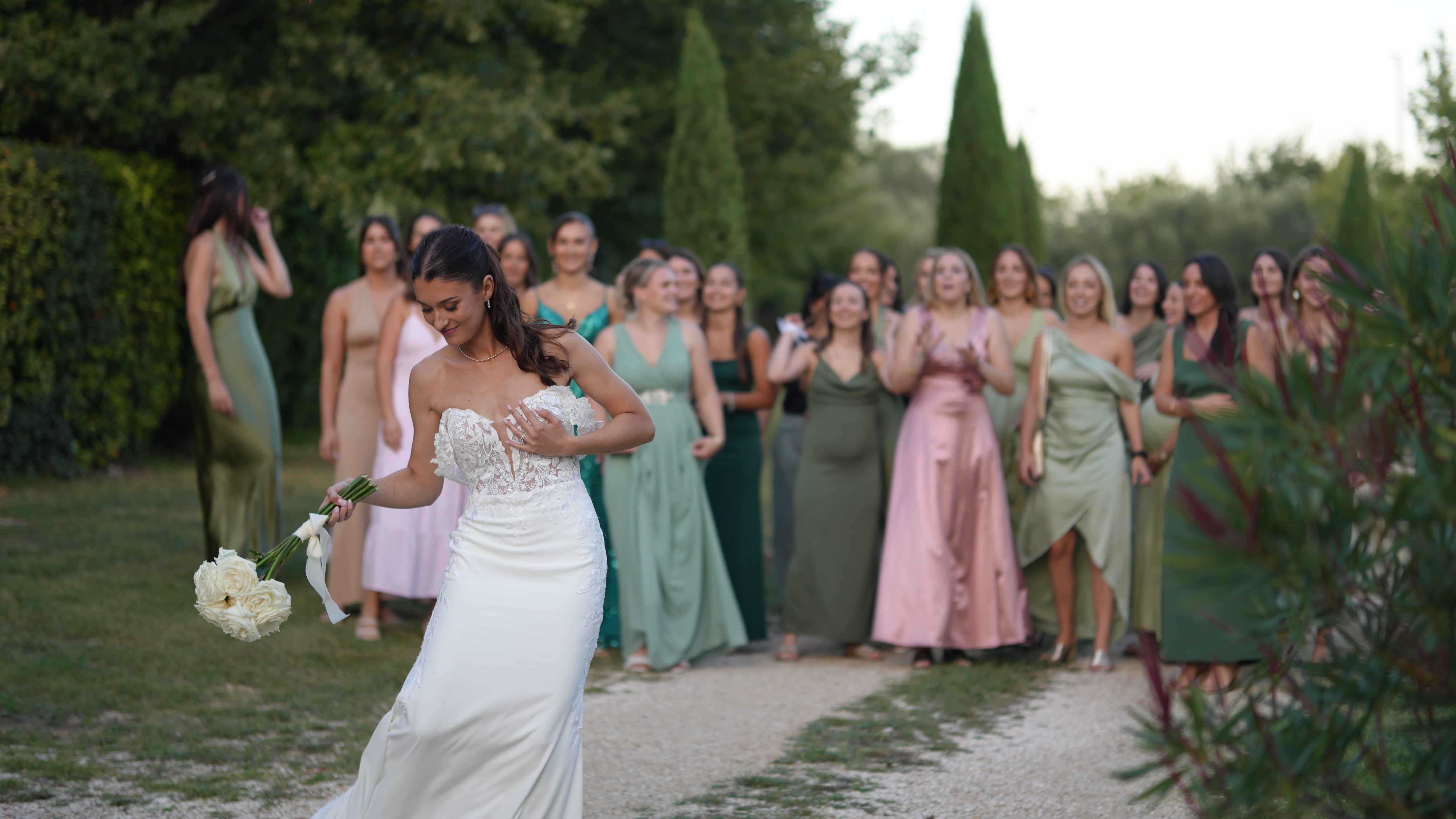
Bouquet toss: energy, motion and emotion
Click the button to switch between the color and black and white versions.
In a bouquet toss, color carries party energy: dresses, flowers, decor and celebration. In black and white, movement, gestures, contrast and tension become more graphic and almost timeless.
Why black and white often feels more emotional
What the brain reads when color disappears
In a visual culture saturated with bright colors, filters and images designed to grab attention in one second, black and white photography keeps a strange power: it may not catch the eye faster, but it often holds it longer.
Light, contrast and texture become the real subject
This is not just nostalgia or a vintage effect. Black and white changes the way we perceive an image. By removing color, one of the brain’s easiest cues, it invites a slower reading focused on light, contrast, texture and expression.
An interesting and very human hypothesis is that the absence of color reduces instant gratification. Less immediate stimulation leaves more room for interpretation. Black and white does not deprive the viewer, it opens space. In that space, we can feel the living substance of the image more deeply.
This is why black and white still seduces people, and why it works so well for art prints and framed photography.
Color, brain and dopamine: immediate pleasure
Color is never neutral. It shapes attention and mood, often without us noticing. Bright hues attract the eye quickly, simplify reading and reinforce immediate pleasure.
In photography, color often acts as an emotional shortcut: we understand faster and feel faster. A color image can be spectacular, seductive and obvious. But that same immediacy can mean we consume the image without really staying with it.
Black and white takes the opposite path. Without color, the brain cannot rely on the easy signal. It compensates by looking harder, searching for clues and rebuilding meaning. The experience becomes slower and more attentive.
When absence creates meaning
By removing color, black and white creates a lack, but a fertile one.
Without color guiding the reading, the image no longer imposes itself: it offers itself. Lines, shadows and textures become the main information. We start reading the image rather than skimming it.
That changes everything. Where color gives a quick answer, black and white asks a question. Instead of saying “look how beautiful this is,” it says “look carefully.”
Because it is less explicit, black and white leaves more room for projection, memory, imagination and interpretation. Two people can feel different things in front of the same picture, and that is often the sign of a strong image.
Timelessness, memory and decor
Black and white has a rare quality: it seems to belong to every era at once.
A monochrome image could have been taken yesterday or fifty years ago. Color often places a picture in a decade through tones, trends and rendering. Black and white steps away from those codes and gains a more universal feel.
For interior decor, that is a major advantage. A framed black and white photo does not overwhelm a room, works with many styles and usually ages more gracefully.
When to choose black and white, and when to stay in color
Ask one simple question: is the emotion in the subject, or in the atmosphere? If the essential part lies in the gaze, texture or light, black and white often wins. If the story depends on color, season, place or atmosphere, color is usually more effective.
Portraits and strong moments
For portraits, couples and intimate scenes, black and white isolates emotion and removes distractions. It also gives visual continuity if you want to build a consistent series.
Landscapes, architecture and everyday scenes
An autumn landscape, sunset or very colorful urban scene often tells its story better in color. But if the power comes from lines, contrast or graphic light, black and white becomes more expressive.
How to choose a black and white photo to frame
If you hesitate between color and black and white, use this simple guide: color tells the setting, black and white tells the essential.
- Portraits and life moments: black and white often highlights emotion, gaze and texture.
- Architecture and graphic scenes: black and white strengthens lines and contrast.
- Landscapes: keep color if the story lives in the hues; test black and white if the story is about light and depth.
- Interior decor: black and white integrates easily and stays timeless, especially in a series or wall gallery.
To elevate a meaningful memory such as a wedding, QR-cadre highlights your images with a photo universe built around emotion, staging and long-term impact.
In short, if you want an image that still holds up over time, black and white is often a very strong choice.
Conclusion
We love black and white because it does not give everything away immediately. It removes some of the instant stimulation of color and asks the eye to engage differently. Where color attracts, black and white holds. Where color describes, black and white reveals.
If a black and white image stays with you longer than the color version, that may be the one worth framing.